How to Create Weekly Performance Reports in Python With Minimal Manual Work
If your weekly performance reports change shape every Friday, automation will feel harder than it is. The fix is boring, but it works: decide on a stable report structure first. Pick the handful of metrics people actually use to make decisions, then keep them consistent. For most teams, that means a few headline KPIs, week-over-week deltas, a couple of trend charts, and a short table showing what moved. Not twenty tabs. Not a giant export dumped into PowerPoint. A report people can scan in three minutes and trust.
This is where a lot of Python report automation projects go sideways. People try to automate chaos. Don’t. Write down the exact inputs, the exact outputs, and the rules for each metric. Define things like “active customer,” “qualified lead,” or “closed revenue” once, in plain English, before you write code. That small bit of discipline saves hours later because your script isn’t just generating numbers; it’s generating the same numbers every week. If you’re a business analyst trying to tighten your workflow, this is the real foundation. Good automated reporting starts with a repeatable business question, not a clever notebook.
Pull your data into one Python pipeline instead of juggling exports
The easiest win is to stop assembling weekly performance reports from five different exports. Build one Python script that collects data from wherever it lives: a warehouse, a CRM API, a marketing platform, flat files dropped in a folder, whatever your stack happens to be. In practice, that usually means pandas for file handling, sqlalchemy or a warehouse connector for SQL, and requests for APIs. Keep each source in its own function. One function loads ad spend. Another pulls pipeline data. Another reads product usage. Then a main script stitches everything together.
Here’s the thing: tidy inputs matter more than fancy libraries. Rename columns early. Standardize dates immediately. Convert percentages and currency fields into consistent types before you do any calculations. Add lightweight validation too. If a source returns zero rows or a required column disappears, the script should fail loudly rather than quietly shipping a broken report. That alone cuts manual checking in half. A clean business analyst workflow usually has three layers: extract, transform, report. Separate those steps and your pipeline becomes easier to debug, easier to extend, and much less annoying when one upstream system changes without warning on a Thursday afternoon.
Use reusable metric functions so your numbers stop drifting
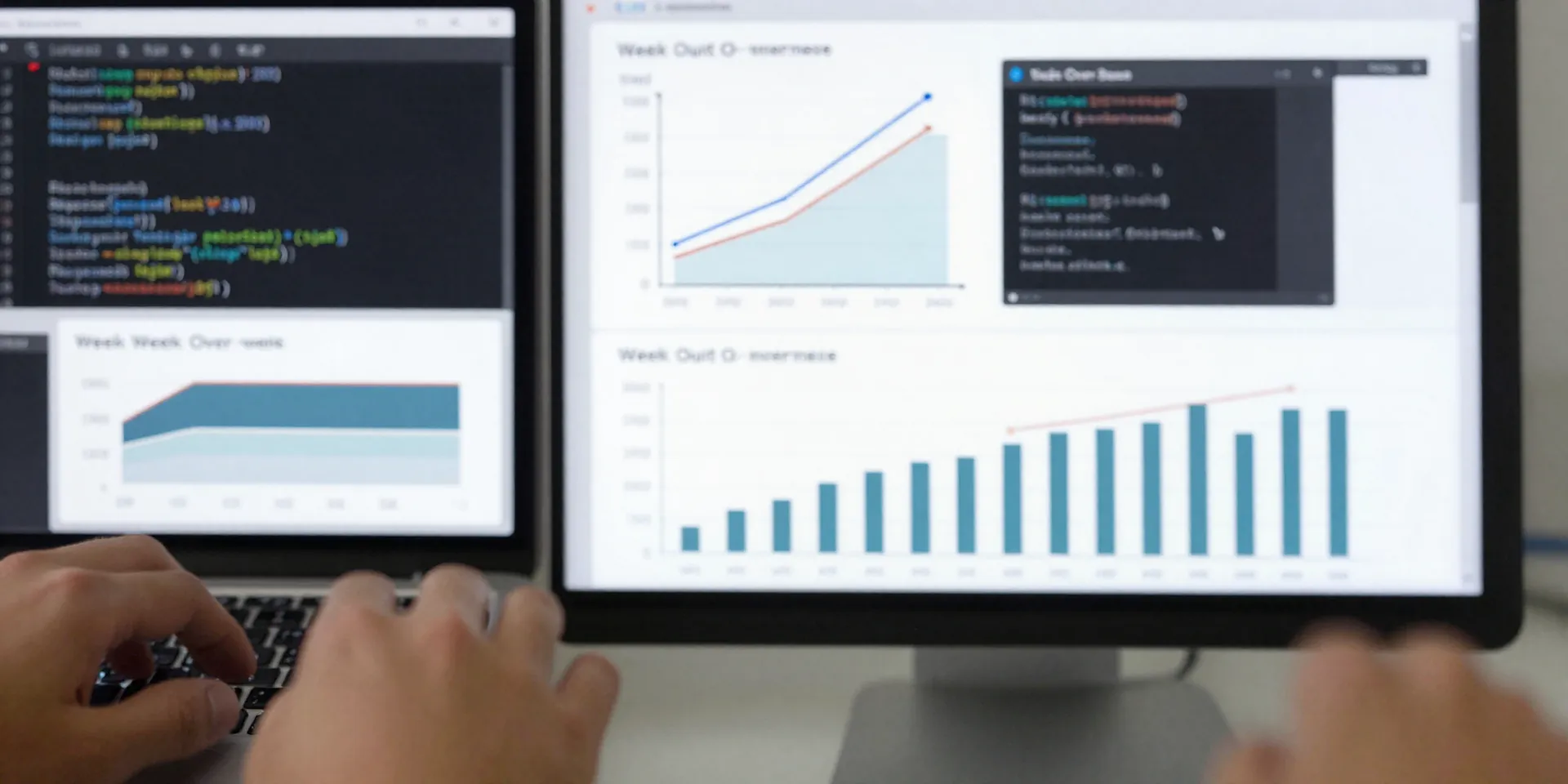
Once the data is loaded, don’t calculate each KPI in an ad hoc way inside chart code or spreadsheet logic. Create reusable functions for the metrics you report every week. A function for week-over-week growth. One for conversion rate. One for retention. One for rolling four-week averages if your data is noisy. This is the part that makes automated reporting reliable instead of merely convenient. The same logic gets used every time, which means fewer “Why does this week’s conversion rate not match last week’s deck?” conversations.
Be opinionated about naming and structure. A metric table with columns like
metric_name, current_value, prior_value, change_abs, change_pct
would be ideal, except you can’t use extra tags here, so think of it that way in your code. The point is to organize metrics as data, not random variables scattered through a notebook. That makes it easy to feed charts, tables, and narrative annotations from the same source of truth. If you need exceptions, keep them visible. For example, maybe some metrics compare to the prior business week while others compare to the prior full calendar week. Fine. Encode those rules explicitly. Hidden spreadsheet logic is where trust goes to die.Generate charts and commentary automatically, but keep the design brutally simple
A good weekly report doesn’t need flashy visuals. It needs quick pattern recognition. Use Python to generate a small set of charts that answer obvious questions: Are we up or down? Is the trend stable? Which segment moved the most? Matplotlib, seaborn, and plotly all work. Pick one and keep the visual language consistent: same colors for the same metrics, same date formatting, same chart order every week. That consistency reduces cognitive load. People shouldn’t have to re-learn the report just because you discovered a new palette.
You can also automate lightweight commentary. Not fake executive prose. Just useful callouts based on thresholds or rankings. If revenue is down 8% week over week, have Python label that change. If a channel drove the largest gain, flag it. If a KPI moved outside a normal range, note it. This is where automated reporting becomes genuinely helpful, because the report stops being a bundle of pictures and starts highlighting what deserves attention. But don’t let the script pretend to be smarter than it is. Rule-based commentary beats overconfident text generation for most internal reports. Clear, narrow observations are enough. Your readers can handle the interpretation.
Export to formats people already use and schedule the whole thing
The best python report automation setup is the one nobody notices because it just shows up on time. After the calculations and charts are ready, export the report in a format your team already uses. That might be Excel with formatted tabs, a PDF generated from HTML, a PowerPoint deck, or even a simple emailed image plus CSV attachment. There’s no prize for choosing the most technical output. If leadership lives in slides, generate slides. If your ops team wants a spreadsheet, give them a spreadsheet. The point is minimal manual work, not a purity contest.
Then schedule it. Cron if you’re on a server. GitHub Actions for lightweight jobs. Airflow if your environment is bigger and already supports it. Even a Windows Task Scheduler setup can be enough for a small team. Add logging, save a timestamped output file, and send a clear failure alert if the job breaks. Actually, this matters more than perfect formatting. A slightly ugly report delivered every Monday at 8 a.m. beats a beautiful one that depends on you remembering to click Run. Once the schedule is reliable, you’ve removed the worst part of the business analyst workflow: the repetitive assembly work that eats attention before the real analysis even starts.
Leave room for human judgment where automation should stop
Minimal manual work does not mean zero human involvement. It means removing the repeatable parts so you can spend your time on the few things automation can’t judge well. Maybe a paid channel dropped because spend was intentionally cut. Maybe product signups spiked because of a one-off press mention. Maybe a warehouse outage delayed order data and the script needs a note before the report goes out. Good weekly performance reports make space for that context. The machine assembles the facts; the analyst adds judgment where it counts.
That’s also how you keep the system from turning into a black box. Review the output each week, especially early on. Spot-check a few core metrics against source systems. Keep a changelog when business definitions change. If you add a new KPI, add it because someone needs it, not because the code made it easy. Over time, your automated reporting process should feel calmer, not more complicated. Less copy-paste. Less cleanup. Fewer last-minute surprises. More time to notice what actually changed and whether it matters. That’s the point of the whole setup, and Python is very good at it when you keep the workflow practical.